fbpx
One of the leading importers of stationary in the country

M25

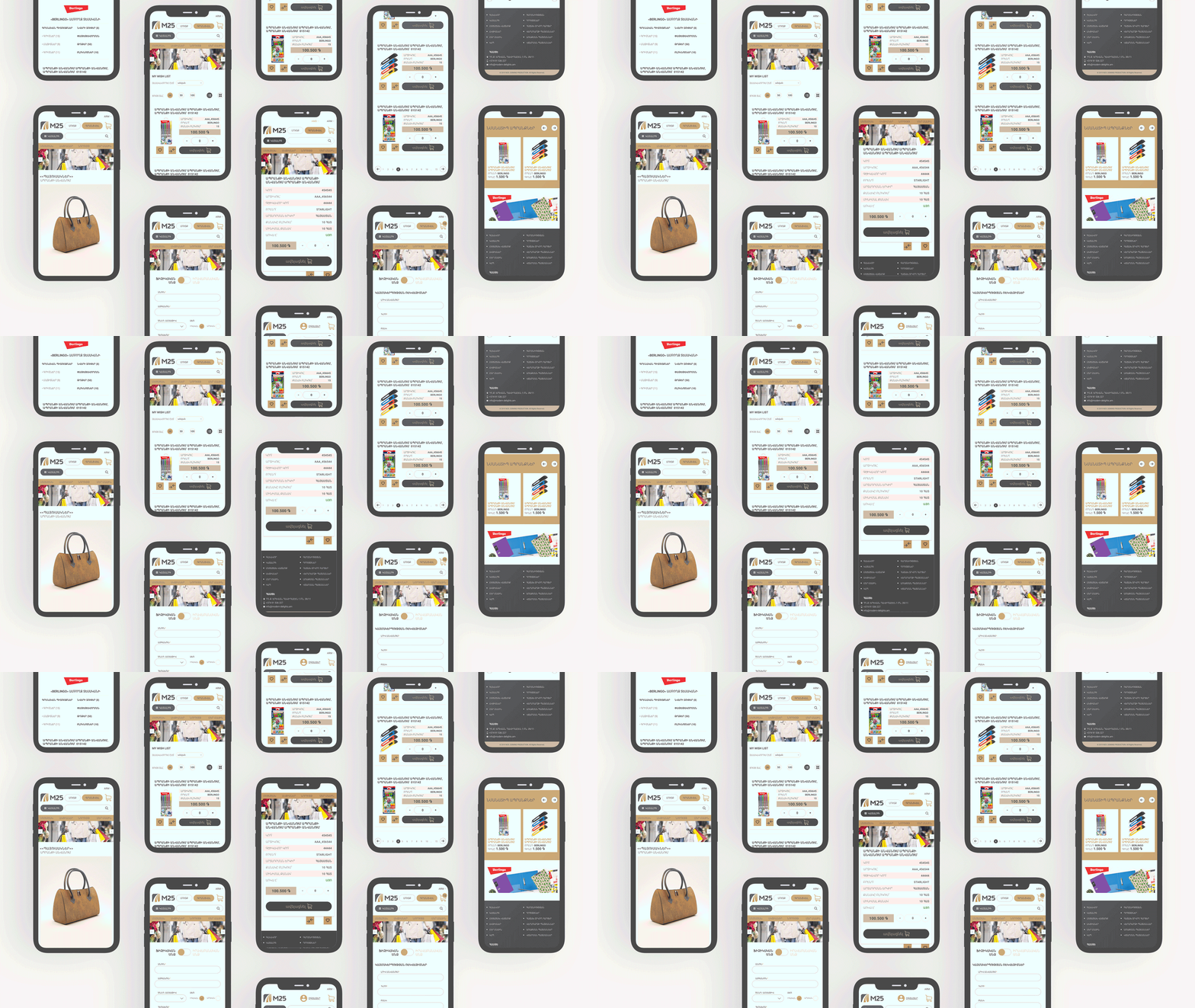
M25 BRANDING AND APPLICATION
WE CHOOSE THE COLOR OF COMPROMISE WHICH ENSURES SERENITY

client
M25
year
2020
type
UI/UX

STATIONARY! THE IMPORTANCE OF THE PRODUCT IS BIGGER THAN IT SEEMS

WHEN YOU MANAGE TO COMBINE THE BRIGHTNESS OF THE PRODUCTS AND THE ASCETICISM OF THE BRAND COLOR

Everyone knows that stationery is very bright and colored to make people, and especially children, happy while working or studying. This brightness attracts and makes you buy at least one small pen or a pencil which can throw you back into your childhood. Domino Production team decided to emphasize the brightness of the products by choosing extremely calm and strict colors. One can think that serious colors like grey and brown do not correspond to the theme of the products our client is representing. We are breaking the stereotype. This was made to avoid the effect of a rainbow in the application, to make it balanced and relaxing. One color highlights the others!

IN OUR BRANDING BRIGHTNESS AND ASCETICISM CAN LIVE TOGETHER!

TIGRIS WINE

next

GO